Symbols, especially those intended to be used all around the world on a daily basis, must be clear and simple. They are a form of non-verbal communication which should be able to give out messages to people of any age and background without the need for a caption. The International Symbol of Access, also referred to as the ‘disabled’ or ‘handicapped’ sign, was designed in 1968 by Susanne Koefoed. However, the sign did not look exactly as we would expect: the figure did not have a head! As we know, a circle was later added to represent the person’s head, but this did not really change the overall impact, neither to the better, nor to the worse. Despite its impersonality, the drawing soon became the only acceptable way of illustrating permission cards, reserved parking spaces, public lavatory facilities for wheelchair users, ramps, buttons to activate automatic doors etc. But now, it’s time for a change! Why? Let me explain…

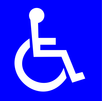
Traditional Symbol of Access, or more accurately one verison of it, as they aren’t all identical (Source: Wikimedia Commons)
I am sure we have all seen the above sign at least once in our lives. This depiction of a person sitting in a wheelchair is now forty-five years old. The design, however, is quite easily objectionable. In my opinion, although I have not found enough evidence to prove this, the symbol was purposely made to be similar to some already existing signs, such as those intended to represent men’s and ladies’ toilets. Many public places offer a disabled toilet besides the obvious male and female ones. In this case, a company would prefer to use a symbol for the third bathroom that looks somewhat similar to the other two, meaning that it shows the same stick figure in a different position (and in a wheelchair). Good, the ISA has passed the test, the gentleman (or lady, if the skirt is there, but we can’t see it) on the door looks exactly like his friends on the two thinner doors.
But what comes first into our minds when we look at this sign? And how is it seen by those who spend quite a lot of time everyday searching for its copies not just on toilet doors, but near a staircase, in a parking area, at the airport or on a taxi? Many people around the world agree on the fact that the well-know disabled symbol displays too much passivity: its arms and legs don’t look real, its posture is unnaturally erect and there is too much emphasis on the wheelchair, causing the person to seem less important. Before deciding to have a closer look at the sign and use the internet to help me in my research, I would never have realised that the International Symbol of Access has a negative message behind it – the wrong message! The main purpose of this sign is to indicate facilities and opportunities reserved for physically disabled people, but the reality is that the internationally recognised drawing does not do a great job at reflecting on their active social participation.
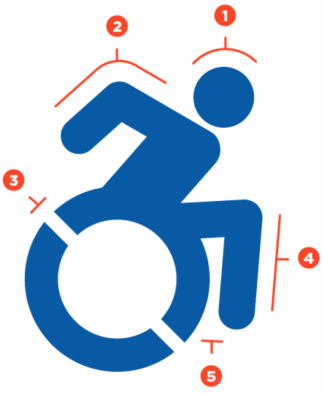
Fortunately, a number of American artists, lawyers, researchers and journalists have teamed up to make a change. The initiative is called The Accessible Icon Project and is an attempt to redesign the ISA in a modern way, thus representing the equality and active lifestyle of the disabled, on the already familiar blue background. So let me introduce the new graphic! Please note that, although several versions of the reformed symbol are in existence and the below image is blue, the preferred style remains the white drawing on a “Handicapped Blue” background.
As you can see, the symbol is much different to its predecessor, but – thanks to the designers – we have been provided with a clear explanation of why each of the alterations was necessary. First of all, the position of the figure’s head is more significant than we would expect. It is a major contributor to the overall impact, so the team had to ensure that the person’s head is forward, indicating a forward motion and that the chair user is the “decision maker about her mobility.” Secondly, the backwards-pointing arms suggest the user’s dynamic ability to move. Some people do not (or cannot) use their arms to drive their wheelchairs, however this detail of the sign does not necessarily depict the figure while doing so and may just be seen as a way of implying their active status. The angled cutouts create the effect that the wheel is in motion, adding more activity to the icon. Also, the rendition of limbs is another important characteristic. This feature of the old symbol is not consistent with body representations in the ‘ISO 7001 – DOT pictograms’, and may therefore lead to confusion. Lastly, the legs on the new sign have been moved forward to maintain the active overall image, but also in favour of better readability.
Sounds good, but there is one more question left: may the new image be confusing for someone who has never seen it before? If I stop thinking about the topic, look away for a minute and then have another quick glance at the redesigned symbol, my first impression is always that the drawing looks similarly to the Georgian letter ბ (‘b’ in the Mkhedruli alphabet) or the Amharaic fidel ፈ for ‘fä’ (Ge’ez script). Whether it is confusing or not, the fact remains that the design of The Accessible Icon Project is ADA Compliant. In a bit more detail, the team’s official website states that “slight variations on the historical International Symbol of Accessibility are generally permissible as long as the symbol clearly displays a wheelchair and signifies accessibility.” I accept this as an answer to my question and hope that the new sign will be just as recognisable as the old one.
I admit that writing ‘will be’ in the previous sentence made me a bit curious. I have read that the replacement of the old signs has already began in New York City and that members of the team have even involved their own children in the process of painting. But how popular will the initiative become? I’ll leave this question to you now, but here is a video that provides more information about what has already been done, and what could be done! Luckily, it also sums up the whole story in a much better way then I have, so please have a look at it to make sure you are familiar with the project, the symbol and its social (and believe it or not, linguistic) significance.


When the new aquatic centre in Adelaide (South Australia) was completed last year, the disabled parking spaces were denoted by stick figures missing one leg and using crutches. There was such a public uproar about it that within a few weeks, the signs had been scrubbed away and replaced by the traditional wheelchair symbol.
Pingback: “The Epitome of Nonchalance and Cynicism” – Hungary’s Jewry Outraged by Flagrant Mistranslations | I wish to be a polyglot!